Network Rail
Network Rail - Wayfinding Design Guidance and Pictogram Redesign
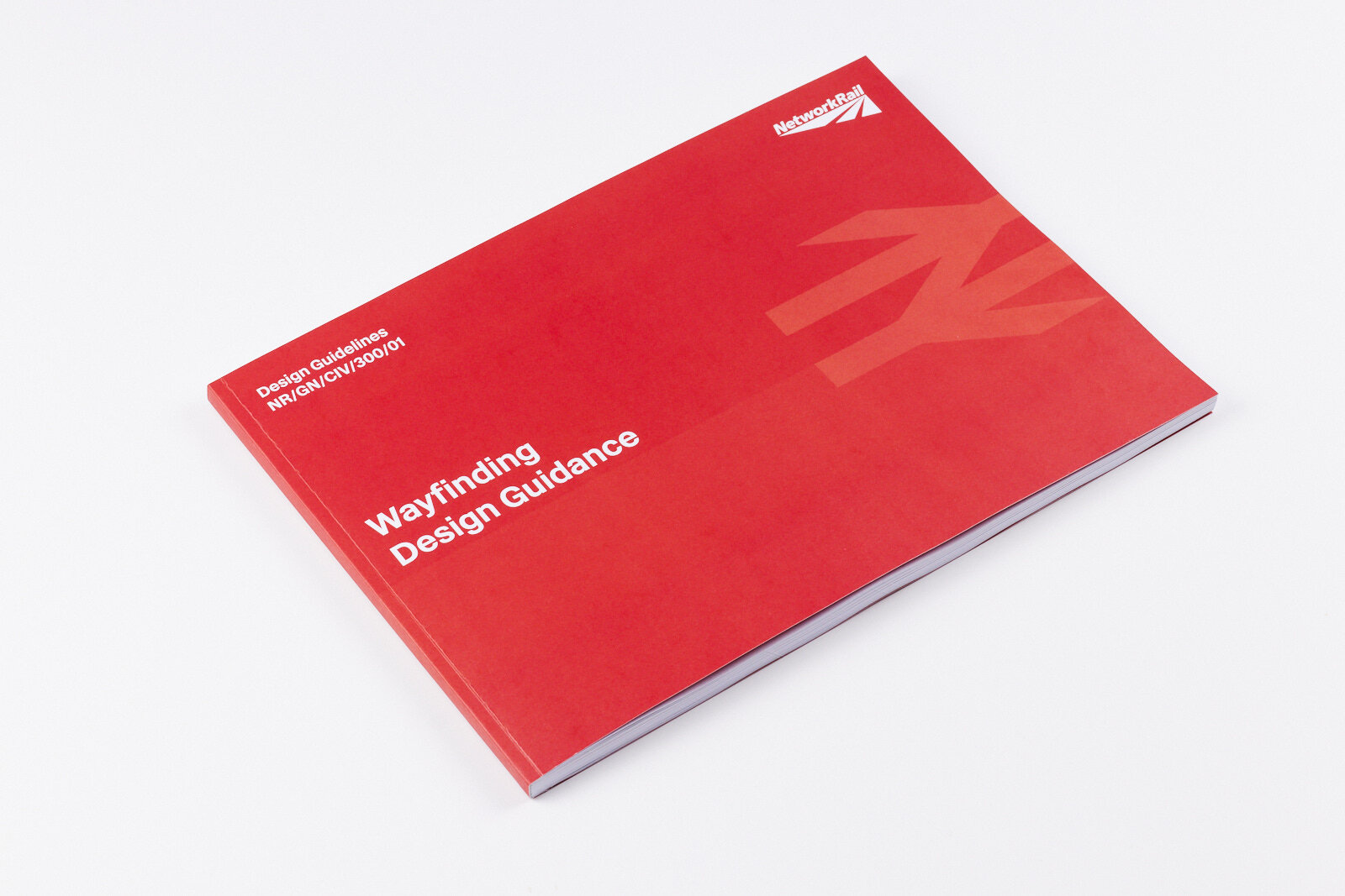
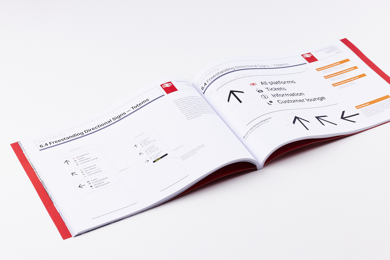
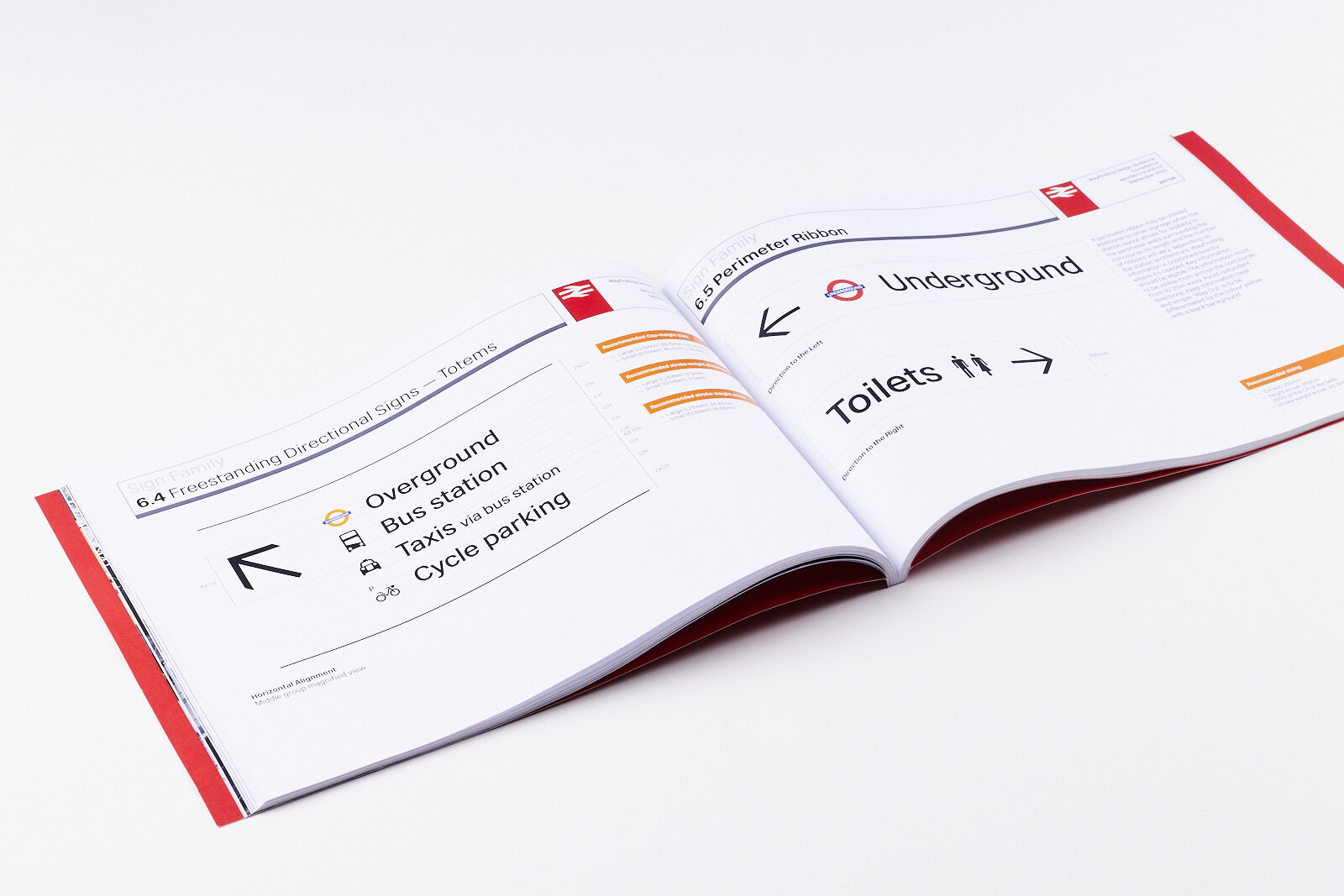
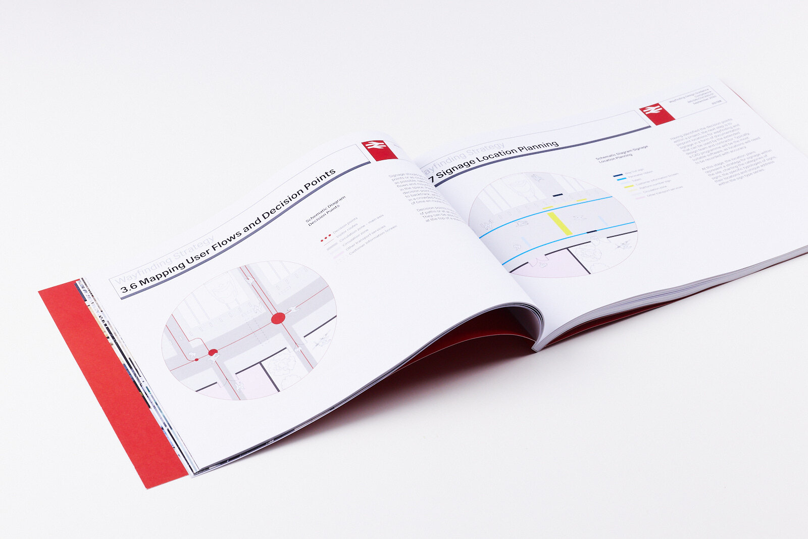
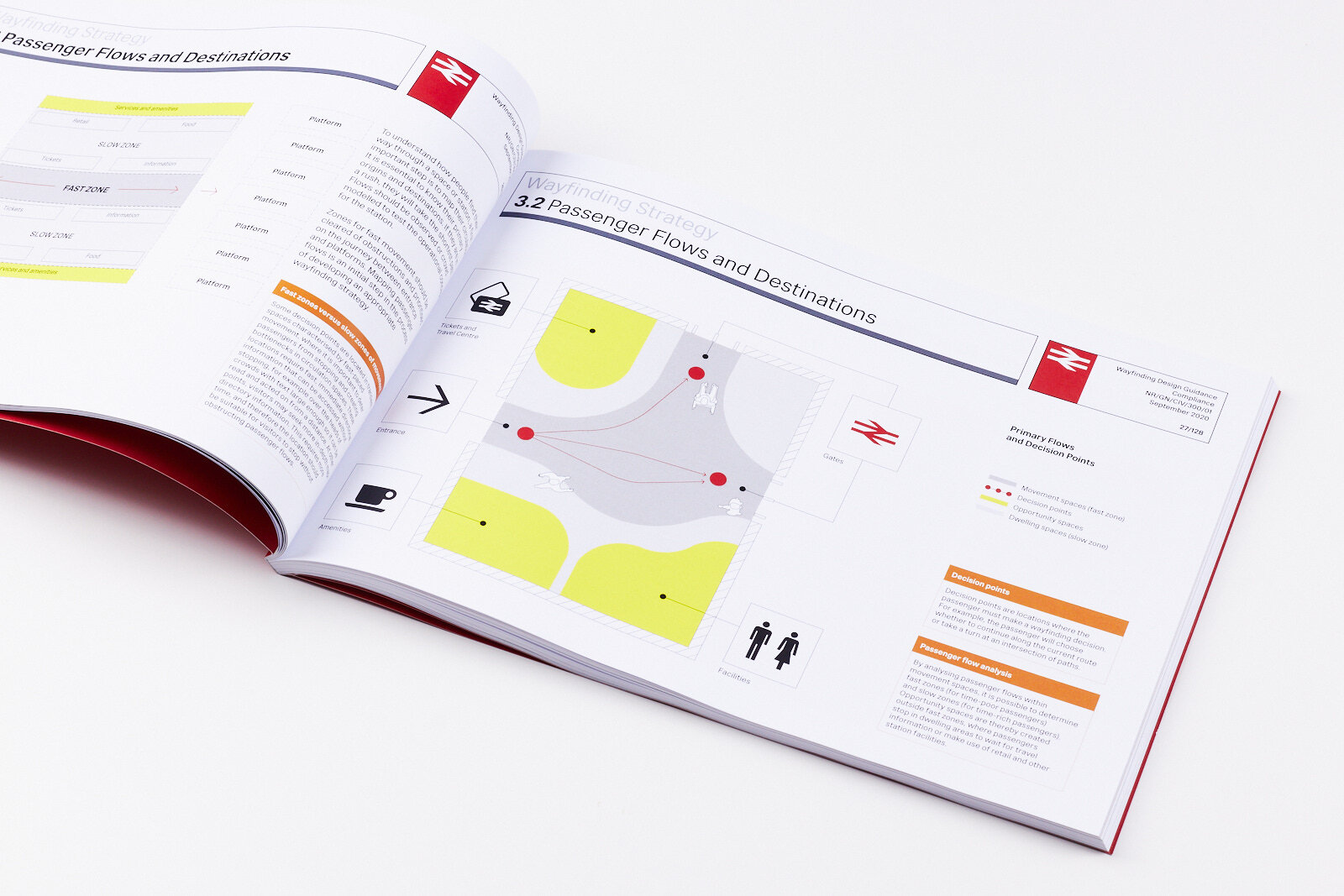
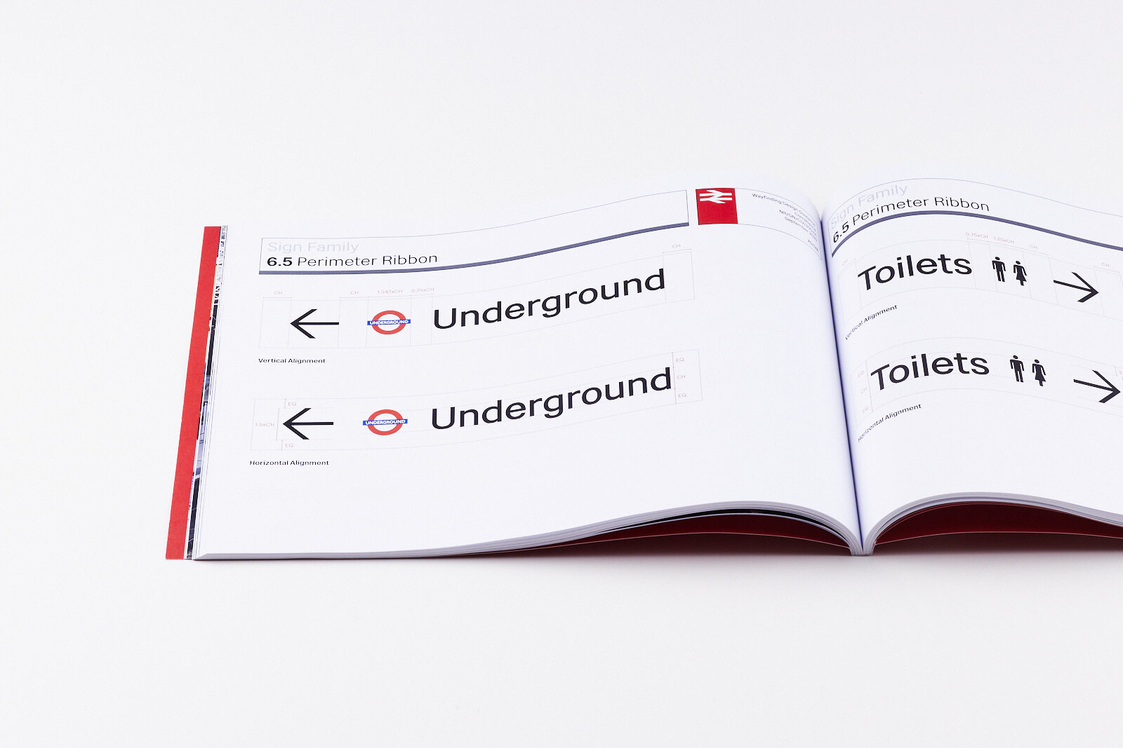
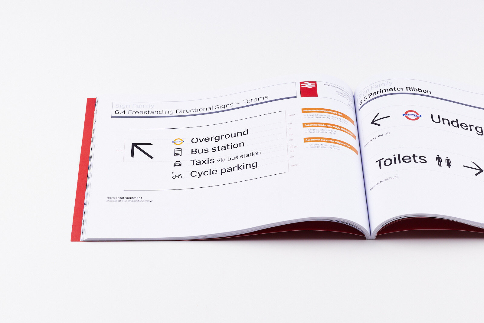
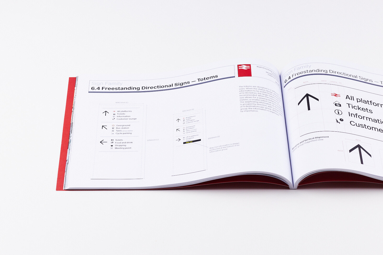
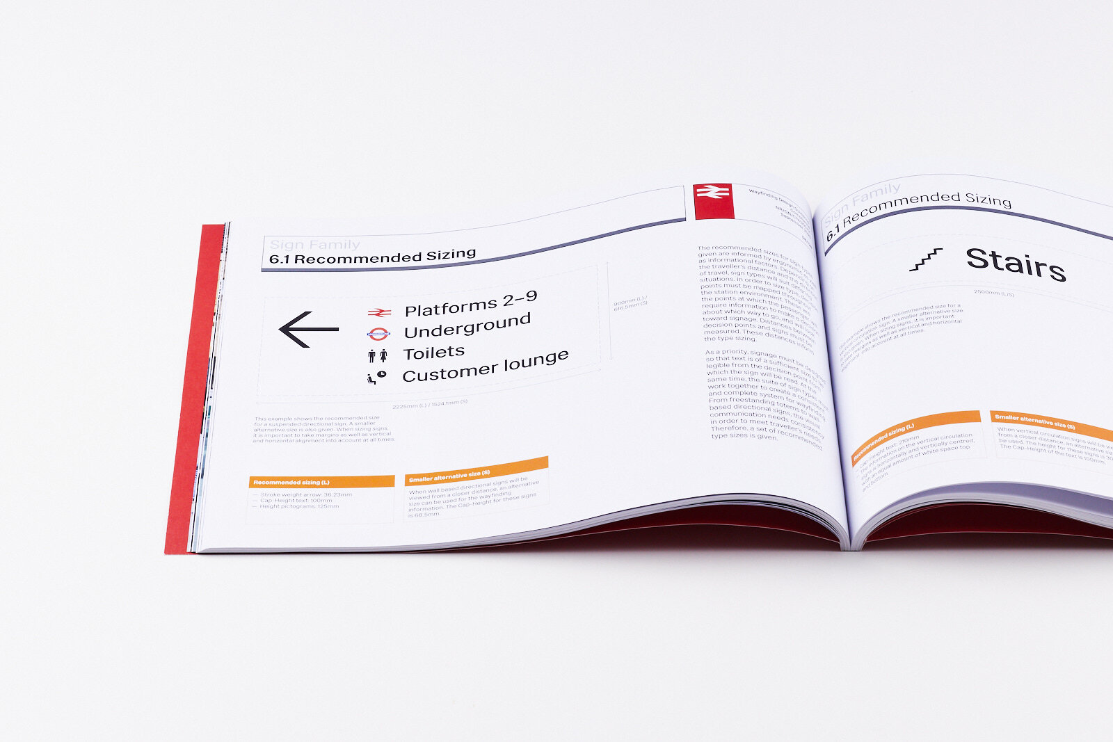
The Wayfinding Design Guidance create guidelines for Network Rail managed station managers, sign manufacturers and others involved in the planning, design and implementation of wayfinding signage for Network Rail.
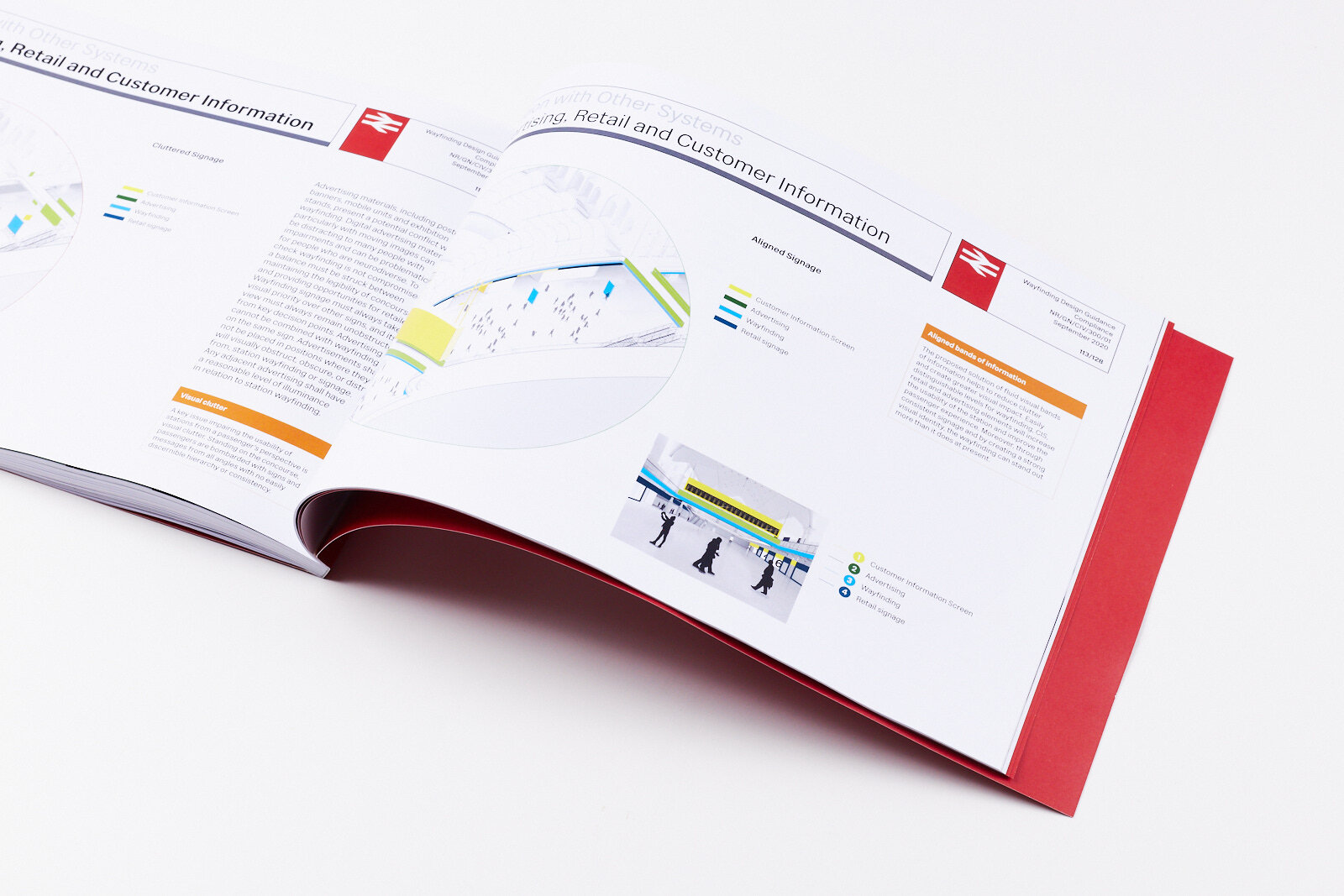
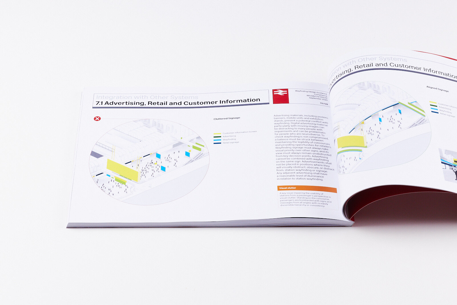
We started with a thorough analysis of the existing wayfinding system, passenger movement and site conditions at various Network Rail managed stations to map out decision points, signage locations and pain points in the existing wayfinding process. A key issue impairing the usability of stations from a passenger’s perspective is visual clutter. Passengers are often bombarded with signs and messages from all angles with no easily discernible hierarchy or consistency. To improve the passenger experience and usability of stations, we established distinguishable levels for wayfinding, customer information, retail and advertising elements in defining signage locations, sizing, hierarchy and information grouping as well as legibility standards.
In parallel we developed overall graphic concepts and a graphic language that drew inspiration from the British Rail history and infrastructure. The three design concepts resulting from this process varied in their approach and transformation of the Network Rail wayfinding system between ‘evolution and revolution’ and combined functional innovations with an updated look.
In a private viewing and stakeholder feedback event these design concepts were presented in form of real size mock ups and in VR fly-throughs, which enabled the guests to experience the wayfinding in stations. Guests were encouraged to fill out a feedback form and to reflect on different aspect of the design options. The results of the survey were carefully reviewed and addressed during the final design development stage.
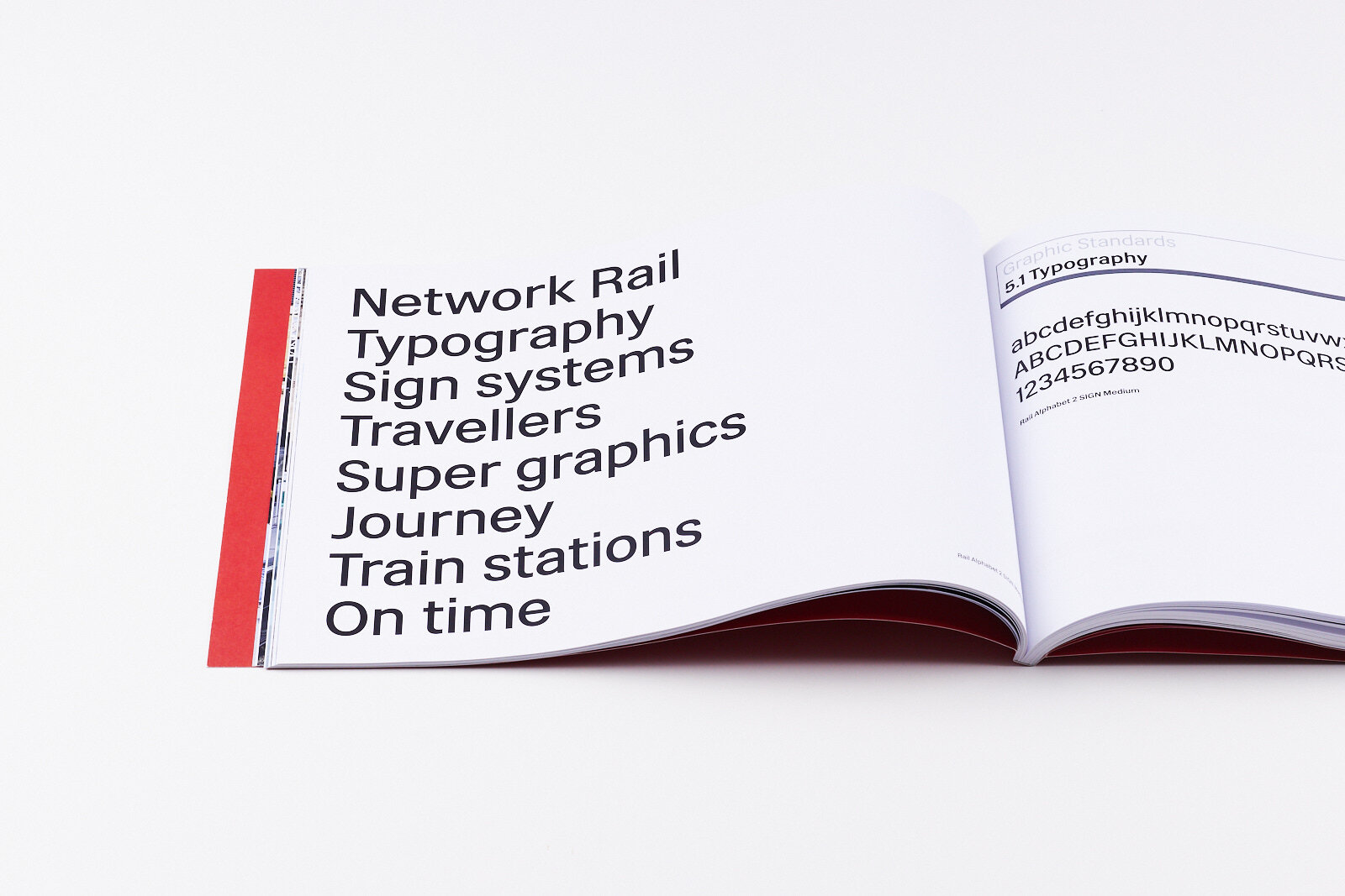
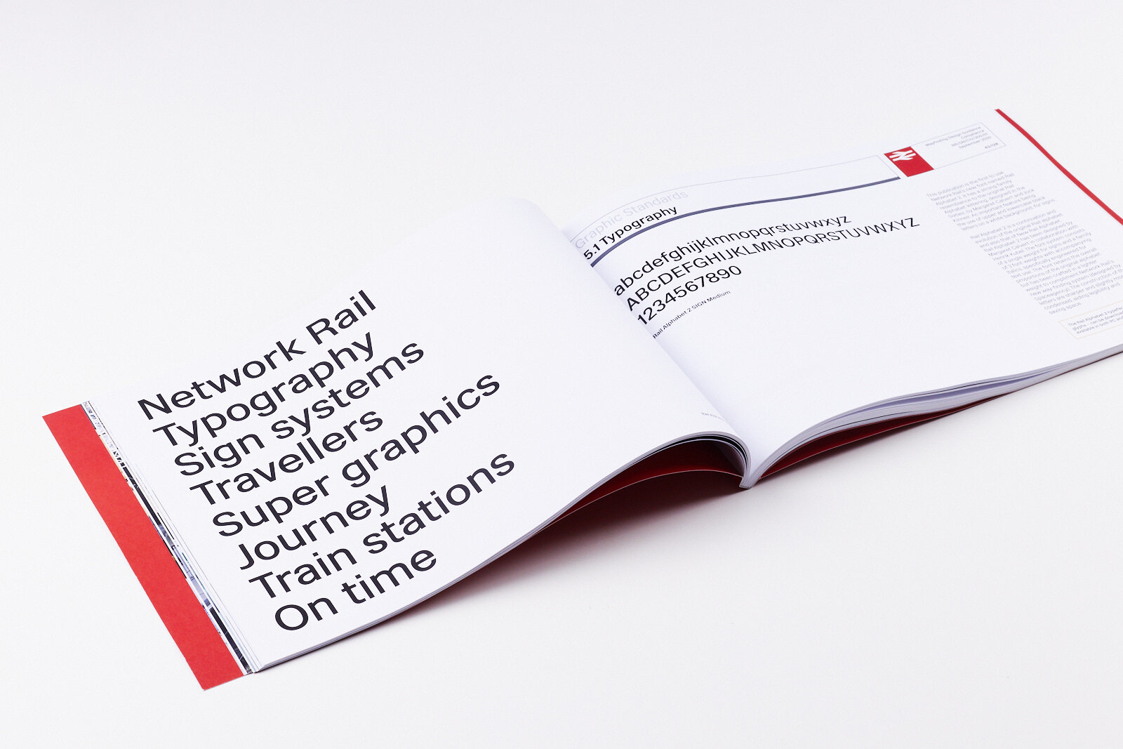
The new wayfinding and signage for Network Rail managed stations is a contemporary refresh of British Rail-inspired minimalist design. The black and white colour palette is timeless and elegant. The wayfinding and signage design uses the typeface Rail Alphabet 2 designed by Margaret Calvert in collaboration with Henrik Kubel.
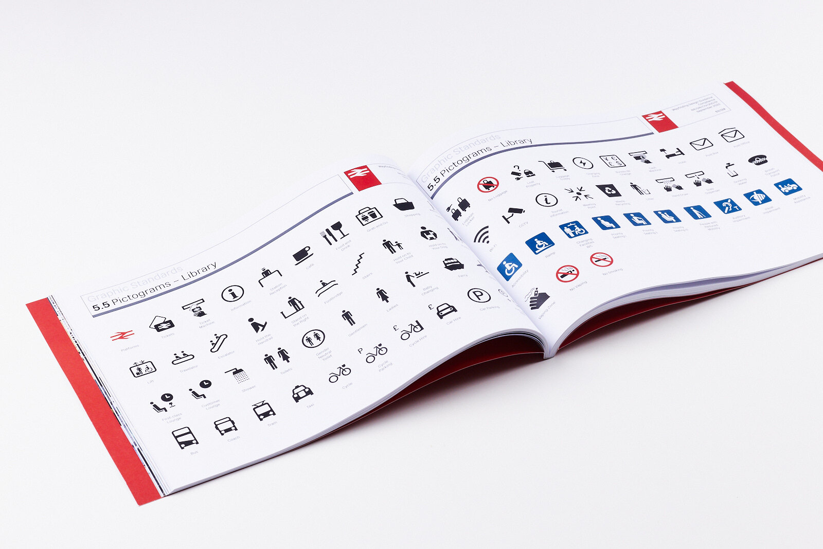
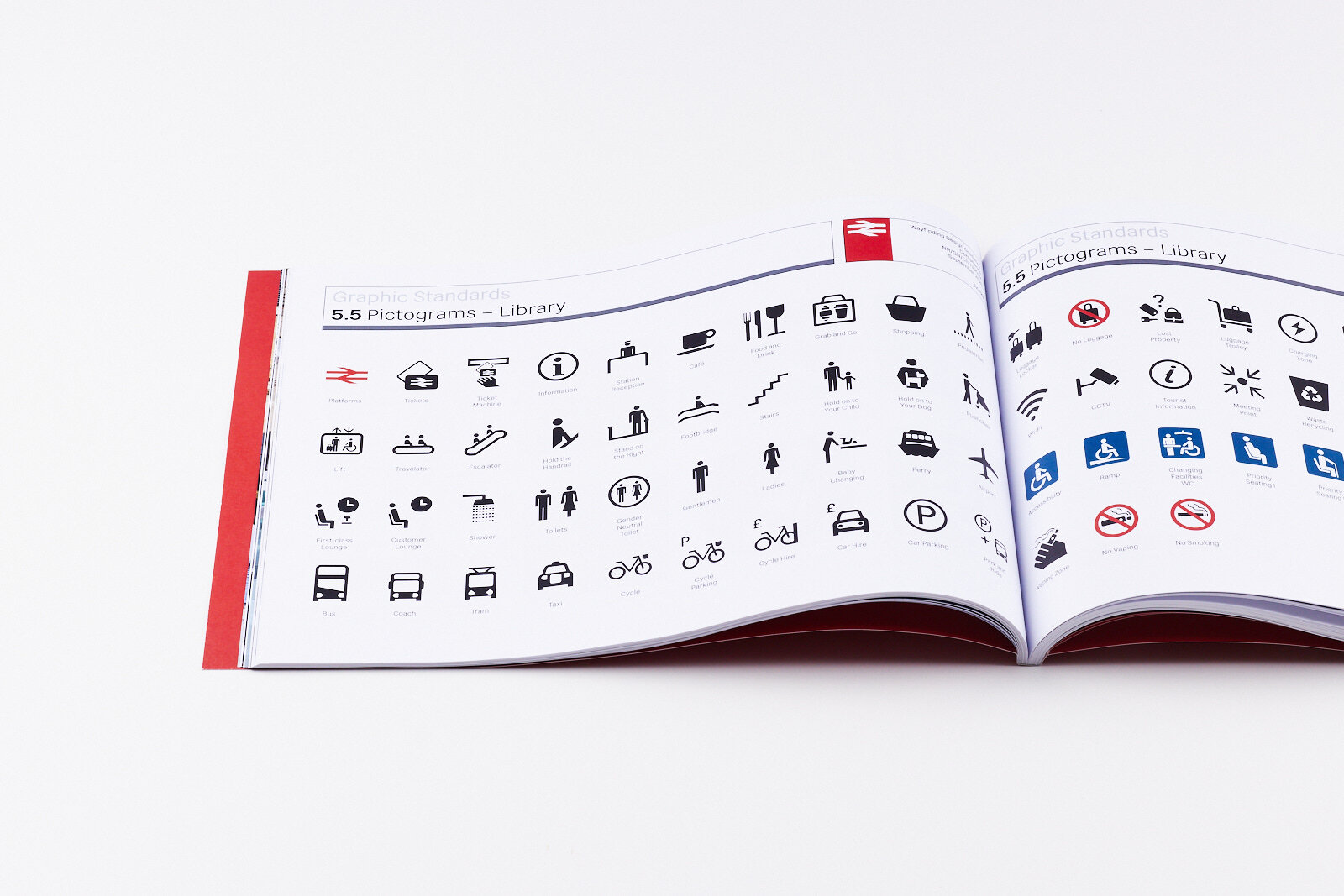
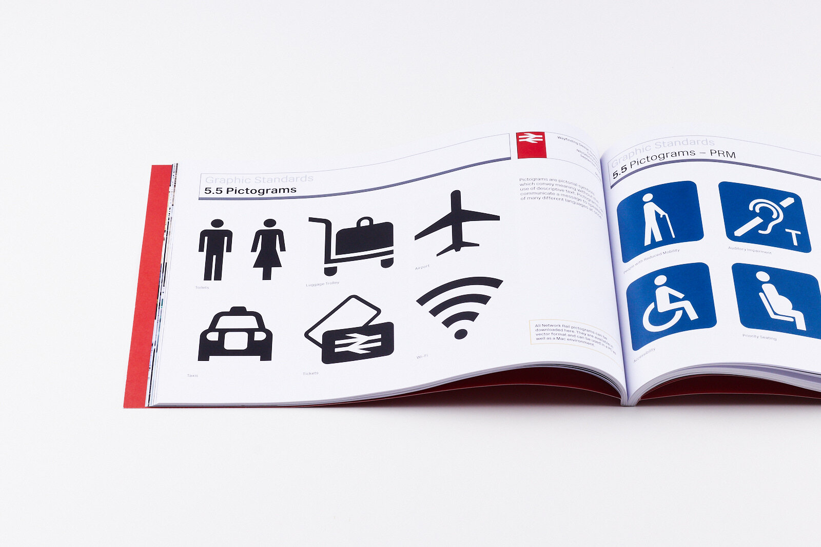
To complete the update of the wayfinding and signage for Network Rail, we redesigned their suite of pictograms. The redesign established a cohesive design language within the suite, completed the set with new pictograms, updated the pictogram messages and aligned with the new typeface and wayfinding design. The pictogram design was carefully developed to comply with international standards at the same time reflecting the cultural context and innovations such as vaping and gender neutral toilets.


